
Craving Crumbs
Brand Identity · Packaging Design · Illustration · Social Media Content
The Brand Evolution
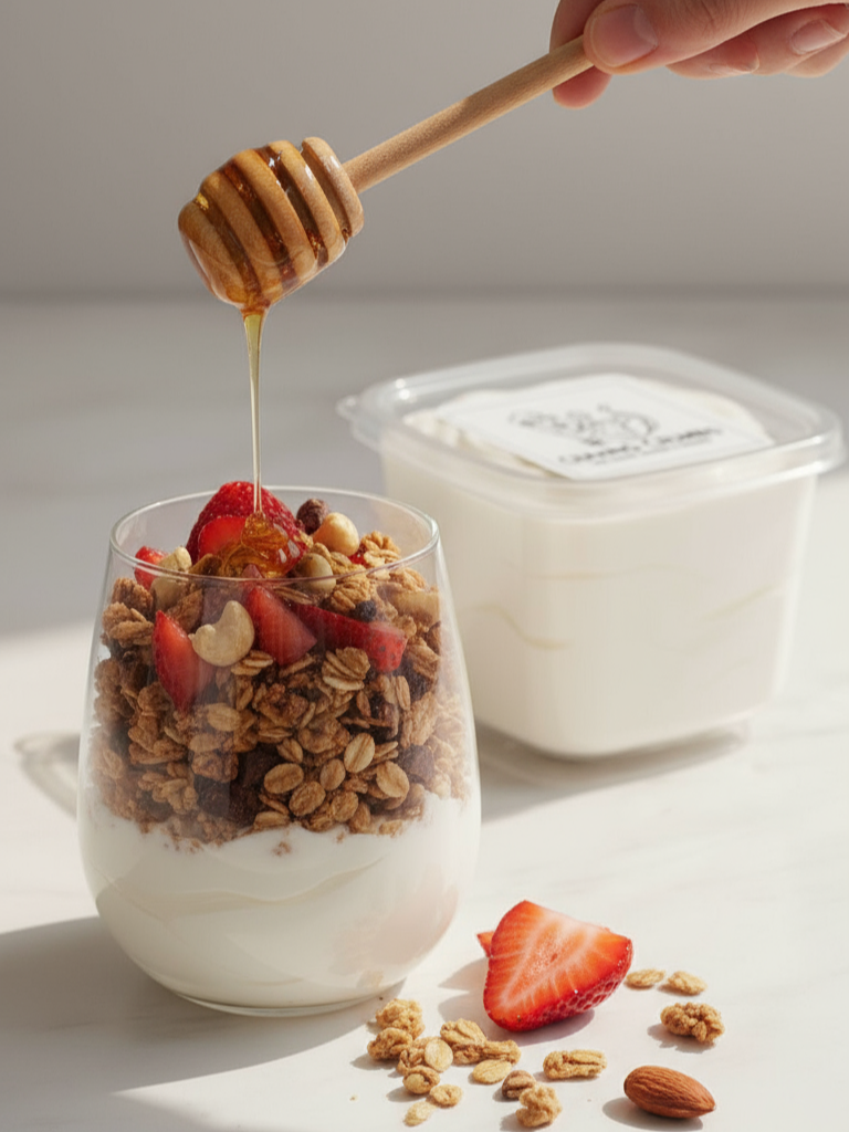
Craving Crumbs began as a homemade New York–style cookie brand known for thick, gooey, indulgent bakes. As the product line expanded to include Greek yogurt, granola, carrot cake, and marshmallow fluff, the visual identity needed to grow alongside it.
I led the full visual rebrand, creating the identity system, packaging structure, photography direction, and all branded graphics used across digital and print platforms.
The goal was to build a cohesive brand that feels warm, handcrafted, and instantly recognizable while remaining flexible enough to evolve.
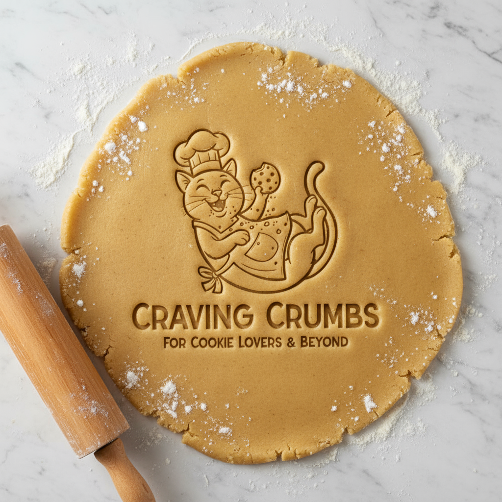
Brand Identity & Mascot Development
A key element of the brand was the inclusion of a cat in the logo, symbolizing comfort and personality. I designed and illustrated the Craving Crumbs mascot from scratch, developing a playful but structured character that functions across packaging, social media, and promotional materials.
The identity system includes
Custom logo and mascot illustration
Ingredient-inspired color palette
Typography pairing
Visual layout structure
Brand tone and texture direction
The result is a brand that feels homemade yet polished, nostalgic but cohesive.
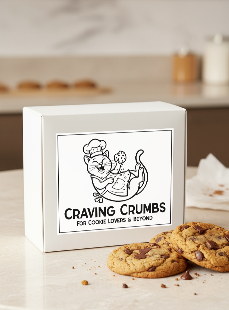
Packaging & Brand Application

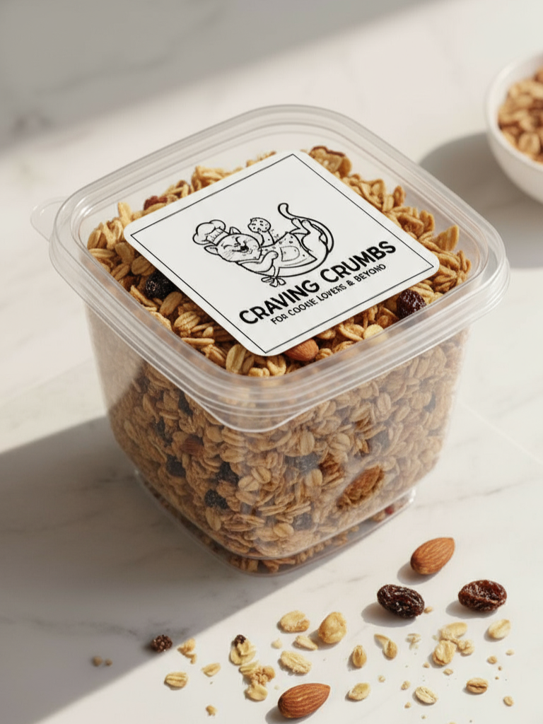
To unify the expanding product line, I designed a modular packaging system that works across cookie boxes, yogurt jars, granola containers, and future product extensions.
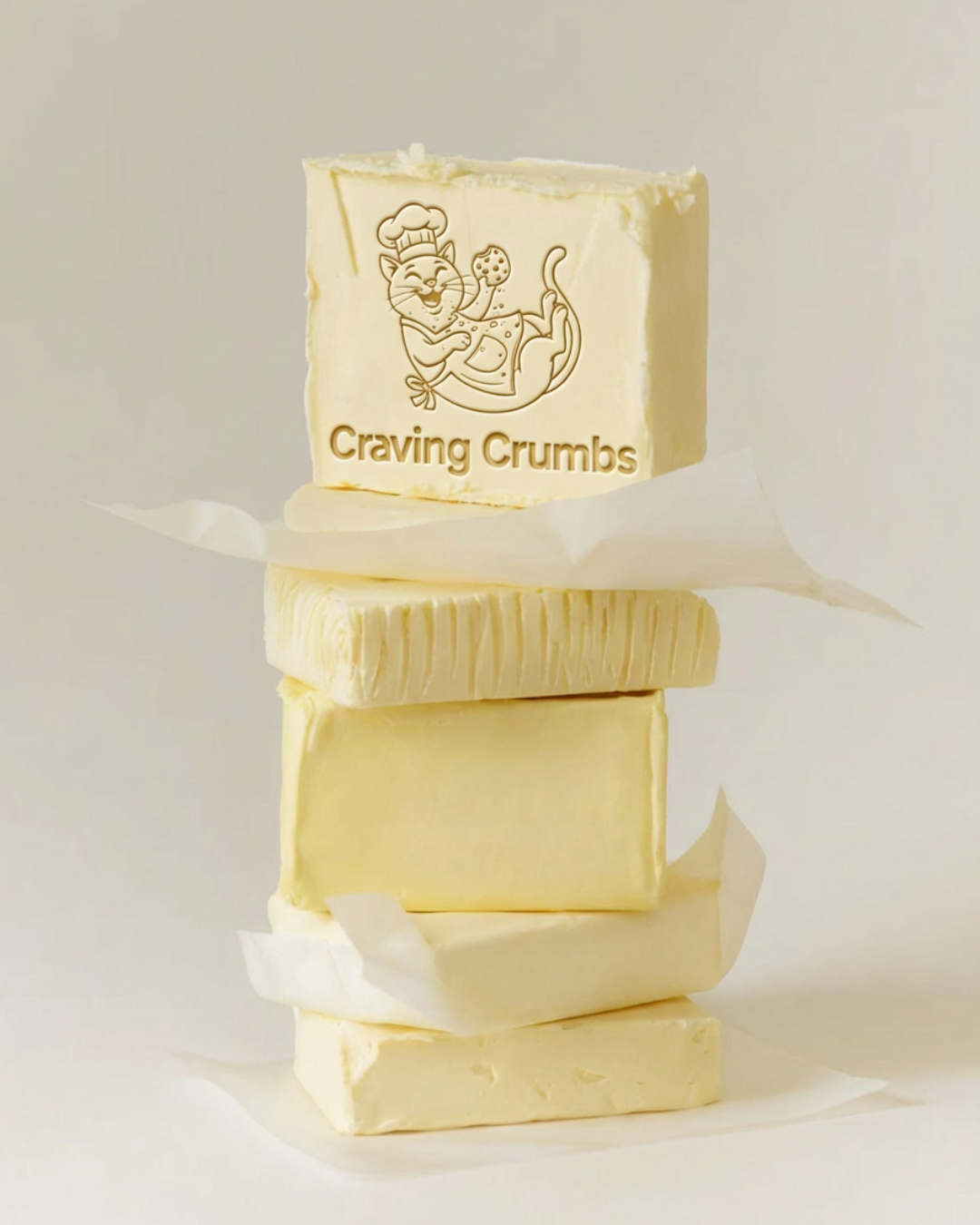
Each product category uses its own accent tone while maintaining consistent illustration, typography, and layout structure. Every label and packaging graphic was designed by me as part of a scalable system that keeps the brand visually aligned across formats.
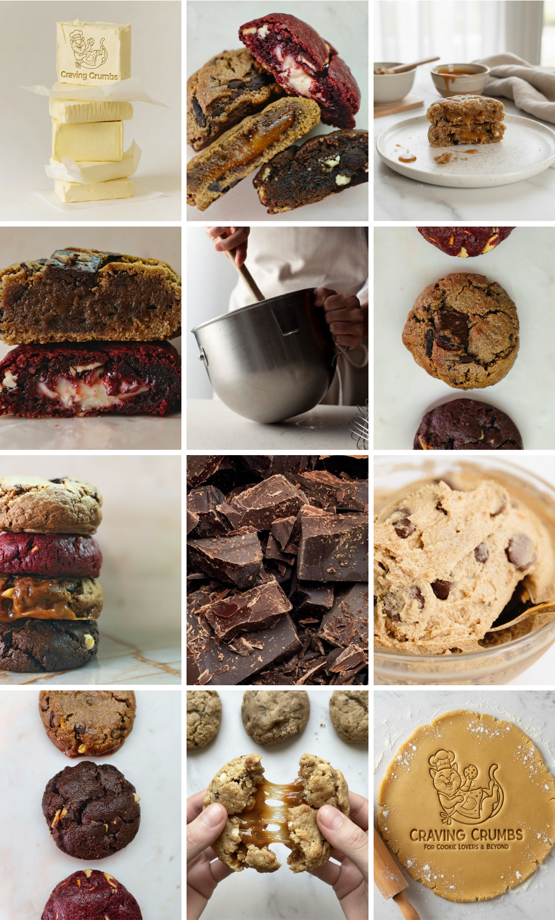
Beyond the label system, I created supporting branded imagery and graphic assets used for advertisements, flyers, promotional materials, and digital campaigns.
Some visuals appear on social media, while others were developed specifically for print promotions, advertising materials, campaign graphics, and brand awareness initiatives.
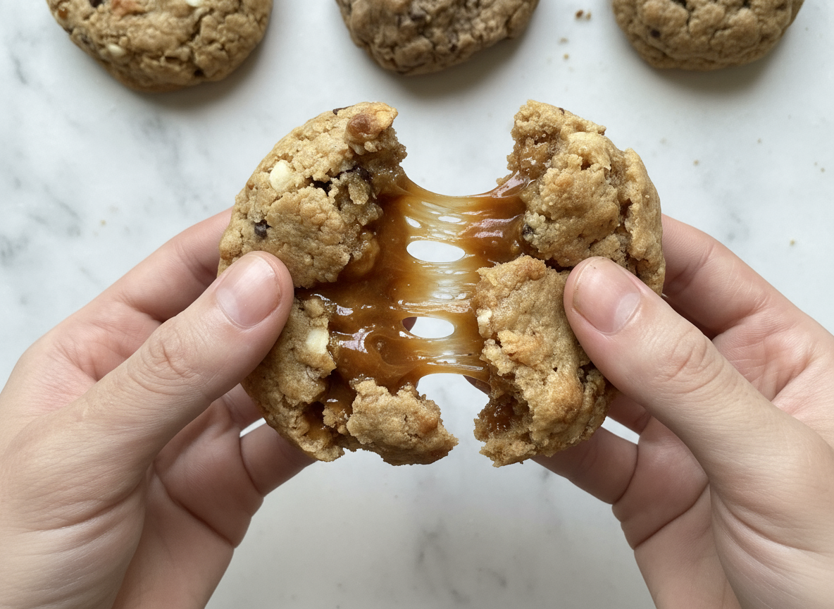
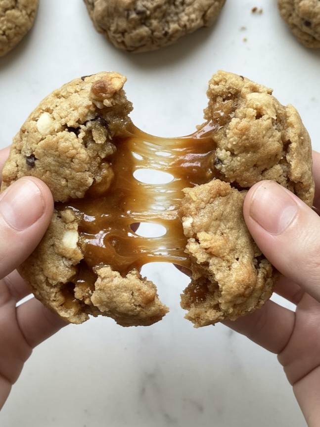
Each asset reinforces the tactile, indulgent nature of the brand through crumbs, melting chocolate, flour dust, stacked layers, raw dough, and soft lighting.
Social Media & Content Direction
Following the rebrand, I developed and designed the full visual direction for Craving Crumbs’ Instagram presence.
I created the post layouts, selected imagery, styled product photography, and structured the feed to balance product, process, and storytelling. Every graphic, composition, and layout shown was created by me as part of a cohesive content strategy.
The content focuses on
Texture-driven close-ups
Ingredient storytelling
Behind-the-scenes baking
Brand identity integration
Hero product moments
Planned Instagram Feed
The feed was intentionally mapped to create rhythm and visual balance. The grid alternates between hero product shots, detail textures, ingredient visuals, and brand identity elements.
It functions as a curated digital storefront that reflects the warmth, indulgence, and cohesion of the overall brand system.